Let’s think about what we’re doing right

In The Better Angels of our Nature: Why Violence Has Declined, Steven Pinker compiles massive amounts of evidence to show that we are becoming a more civilized species. The principal yardstick he uses to measure progress is the steady decline, over millenia, in per-capita rates of homicide. But he also measures declines in violence directed towards women, racial groups, children, homosexuals, and animals.

It’s hard to read the chapters about the routine brutality of life during the Roman empire, the Middle Ages, the Renaissance, and — until more recently than we like to imagine — the modern era. An early example:

Far from being hidden in dungeons, torture-executions were forms of popular entertainment, attracting throngs of jubilant spectators who watched the victim struggle and scream. Bodies broken on wheels, hanging from gibbets, or decomposing in iron cages where the victim had been left to die of starvation and exposure were a familiar part of the landscape.

A modern example:

Consider this Life magazine ad from 1952:

Today this ad’s playful, eroticized treatment of domestic violence would put it beyond the pale of the printable. It was by no means unique.

A reader of that 1950s ad would be as horrified as we are today to imagine cheering a public execution in the 1350s. A lot changed in 600 years. But in the 60 years since more has changed. The ad that seemed OK to a 1950s reader would shock most of us here in the 2010s.

Over time we’ve grown less willing and able to commit or condone violence, and our definition of what counts as violence has grown more inclusive. And yet this is deeply counter-intuitive. We tend to feel that the present is more violent and dangerous than the recent past. And our intuition tells us that the 20th century must have been more so than the distant past. That’s why Pinker has to marshal so much evidence. It’s like Darwin’s rhetorical strategy in The Origin of Species. You remind people of a lot of things that they already know in order to lead them to a conclusion they wouldn’t reach on their own.

Will the trend continue? Will aspects of life in the 2010s seem alien to people fifty years hence in the same way that the coffee ad seems alien to us now, and that torture-execution seemed to our parents? (And if so, which aspects?)

Pinker acknowledges that the civilizing trend may not continue. He doesn’t make predictions. Instead he explores, at very great length, the dynamics that have brought us to this point. I won’t try to summarize them here. If you don’t have time to read the book, though, you might want to carve out an hour to listen to his recent Long Now talk. You’ll get much more out of that than from reading reviews and summaries.

Either way, you may dispute some of the theories and mechanisms that Pinker proposes. But if you buy the premise — that all forms of violence have steadily declined throughout history — I think you’ll have to agree with him on one key point. We’re doing something right, and we ought to know more about why and how.

Flash Fill: Text wrangling for non-programmers

As Elm City hubs grow, with respect to both raw numbers of events and numbers of categories, unfiltered lists of categories become unwieldy. So I’m noodling on ways to focus initially on a filtered list of “important” categories. The scare quotes indicate that I’m not yet sure how to empower curators to say what’s important. Categories with more than a threshold number of events? Categories that are prioritized without regard to number of events? Some combination of these heuristics?

To reason about these questions I need to evaluate some data. One source of data about categories is the tag cloud. For any Elm City hub, you can form this URL:

elmcity.cloudapp.net/HUBNAME/tag_cloud

If HUBNAME is AnnArborChronicle, you get a JSON file that looks like this:

[
{ "aadl":348},
{ "aaps":9},
{ "abbot":18},
...
]

This is the data that drives the category picklist displayed in the default rendering of the Ann Arbor hub. A good starting point would be to dump this data into a spreadsheet, sort by most populous categories, and try some filtering.

I could add a feature that serves up this data in some spreadsheet-friendly format, like CSV (comma-separated variable). But I am (virtuously) lazy. I hate to violate the YAGNI (“You aren’t gonna need it”) principle. So I’m inclined to do something quick and dirty instead just to find out if it’ll even be useful to work with that data in a spreadsheet..

One quick-and-dirty approach entails looking for some existing (preferably online) utility that does the trick. In this case I searched for things with names like json2csv and json2xls, found a few candidates, but nothing that immediately did what I wanted.

So some text needs to be wrangled. One source of text to wrangle is the HTML page that contains the category picklist. If you capture its HTML source, you’ll find a sequence of lines like this:

<option value="aadl">aadl (348)</option>
<option value="aaps">aaps (9)</option>
<option value="abbot">abbot (18)</option>

It’s easy to imagine a transformation that gets you from there to here:

aadl	348
aaps	9
abbot	18

Although I’ve often written code to do that kind of transformation, if it’s a quick-and-dirty one-off I don’t even bother. I use the macro recorder in my text editor to define a sequence like:

  • Start selecting at the beginning of a line
  • Go to the first >
  • Delete
  • Go to whitespace
  • Replace with tab
  • Search for (
  • Delete
  • Search for )
  • Delete to end of line
  • Go to next line

This is a skill that’s second nature to me, and that I’ve often wished I could teach others. Many people spend crazy amounts of time doing mundane text reformatting; few take advantage of recordable macros.

But the reality is that recordable macros are the first step along the slippery slope of programming. Most people don’t want to go there, and I don’t blame them. So I’m delighted by a new feature in Excel 2013, called Flash Fill, that will empower everybody to do these kinds of routine text transformations.

Here’s a picture of a spreadsheet with HTML patterns in column A, an example of the name I want extracted in column B, and an example of the number I want in column C.

Given that setup, you invoke Flash Fill in the first empty B and C columns to follow the examples in B1 and C1. Here’s the resulting spreadsheet on SkyDrive. Wow! That’s going to make a difference to a lot of people!

Suppose your data source were instead JSON, as shown above. Here’s another spreadsheet I made using Flash Fill. As will be typical, this took a bit of prep. Flash Fill needs to work on homogenous rows. So I started by dumping the JSON into JSONLint to produce text like this:

[
    {
        "aadl": 348
    },
    {
        "aaps": 9
    },
    {
        "abbot": 18
    },
...
]

I imported that text into Excel 2013 and sorted to isolate a set of rows with a column A like this:

"aadl": 348
"aaps": 9
"abbot": 18

At that point it was a piece of cake to get Flash Fill to carry the names over to column B and the numbers to column C.

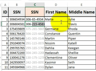
Here’s a screencast by Michael Herman that does a nice job showing what Flash Fill can do. It also illustrates a fascinating thing about programming by example. At about 1:25 in the video you’ll see this:

Michael’s example in C1 was meant to tell Flash Fill to transform strings of 9 digits into the familiar nnn-nn-nnnn pattern. Here we see its first try at inferring that pattern. What should have been 306-60-4581 showed up as 306-215-4581. That’s wrong for two reasons. The middle group has three digits instead of two, and they’re the wrong digits. So Michael corrects it and tries again. At 1:55 we see Flash Fill’s next try. Here, given 375459809, it produces 375-65-9809. That’s closer, the grouping pattern looks good, but the middle digits aren’t 45 as we’d expect. He fixes that example and tries again. Now Flash Fill is clear about what’s wanted, and the rest of the column fills automatically and correctly.

But what was Flash Fill thinking when it produced those unintended transformations? And could it tell us what it was thinking?

From a Microsoft Research article about the new feature:

Gulwani and his team developed Flash Fill to learn by example, not demonstration. A user simply shows Flash Fill what he or she wants to do by filling in an Excel cell with the desired result, and Flash Fill quickly invokes an underlying program that can perform the task.

It’s the difference between teaching someone how to make a pizza step by step and simply showing them a picture of a pizza and minutes later eating a hot pie.

But that simplicity comes with a price.

“The biggest challenge,” Gulwani says, “is that learning by example is not always a precise description of the user’s intent — there is a lot of ambiguity involved.

“Take the example of Rick Rashid [Microsoft Research’s chief research officer]. Let’s say you want to convert Rick Rashid to Rashid, R. Where does that ‘R’ come from? Is it the ‘R’ of Rick or the ‘R’ of Rashid? It’s very hard for a program to understand.”

For each situation, Flash Fill synthesizes millions of small programs — 10-20 lines of code — that might accomplish the task. It sounds implausible, but Gulwani’s deep research background in synthesizing code makes it possible. Then, using machine-learning techniques, Flash Fill sorts through these programs to find the one best-suited for the job.

I suspect that while Flash Fill could tell you what it was thinking, you’d have a hard time understanding how it thinks. And for that reason I suspect that hard-core quants won’t rush to embrace it. But that’s OK. Hard-core quants can write code. Flash Fill is for everybody else. It will empower regular folks to do all sorts of useful transformations that otherwise entail ridiculous manual interventions that people shouldn’t waste time on. Be aware that you need to check results to ensure they’re what you expect. But if you find yourself hand-editing text in repetitive ways, get the Excel 2013 preview and give Flash Fill a try. It’s insanely useful.


Homicide rates in context

In U.N. Maps Show U.S. High in Gun Ownership, Low in Homicides, A.W.R. Hawkins presents the following two maps:

From these he concludes:

Notice the correlation between high gun ownership and lower homicide rates.

As these maps show, “more guns, less crime” is true internationally as well as domestically.

The second map depicts homicides per 100,000 people. That’s the same yardstick used in Steven Pinker’s monumental new book The Better Angels of Our Nature: Why Violence has Declined. Pinker marshals massive amounts of data to show that over the long run, and at an accelerating pace, we are less inclined to harm one another. When you look at the data on a per capita basis, even the mass atrocities of the 20th century are local peaks along a steadily declining sawtooth trendline.

One of the most remarkable charts in the book ranks the 20 deadliest episodes in history. It’s adapted from Matthew White’s The Great Big Book of Horrible Things, and appears in a slightly different form in The New Scientist:

Ever heard of the An Lushan Revolt? Well, I hadn’t, but on a per capita basis it dwarfs the first World War.

Pinker says, in a nutshell, that we’re steadily becoming more civilized, and that data about our growing reluctance to kill or harm one another show that. The trend marches through history and spans the globe. There’s regional variation, of course. A couple of charts show the U.S. to be about 5x more violent than Canada and the U.K. But there isn’t one that ranks the U.S. in a world context. So A.W.R. Hawkins’ map of homicide rates got my attention.

The U.S. has the most guns, the first chart says. And it’s one of the safest countries, the second chart says. But that second map doesn’t tell us:

    Where does the U.S. rank?

    How many countries are in the red, pink, yellow, and green categories?

    Which countries are in those categories?

    How do countries rank within those categories?

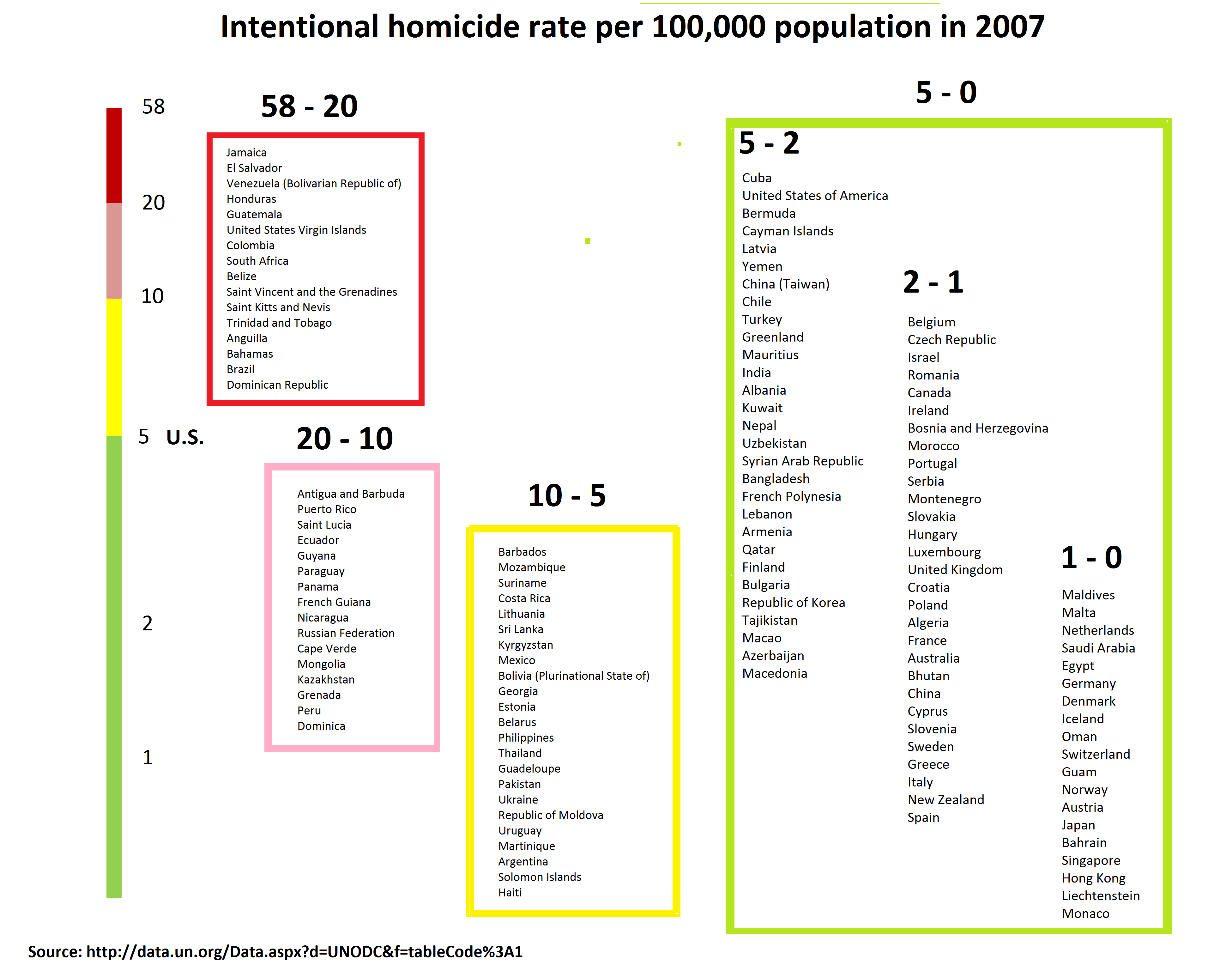
Here’s another way to visualize the data:

There are a lot of countries mashed together in that green zone. And after Cuba we’re the most violent of them. Five homicides per 100,000 isn’t a number to boast about.

Scientific storytelling

It’s said that every social scientist must, at some point, write a sentence that begins: “Man is the only animal that _____.” Some popular completions of the sentence have been: uses tools, uses language, laughs, contemplates death, commits atrocities. In his new book Jonathan Gottschall offers another variation on the theme: storytelling is the defining human trait. For better and worse we are wired for narrative. A powerful story that captures our attention can help us make sense of the world. Or it can lead us astray.

A story we’ve been told about Easter Island goes like this. The inhabitants cut down all the trees in order to roll the island’s iconic 70-ton statues to their resting places. The ecosystem crashed, and they died off. This story is told most notably by Jared Diamond in Collapse and (earlier) in this 1995 Discover Magazine article:

In just a few centuries, the people of Easter Island wiped out their forest, drove their plants and animals to extinction, and saw their complex society spiral into chaos and cannibalism.

As we try to imagine the decline of Easter’s civilization, we ask ourselves, “Why didn’t they look around, realize what they were doing, and stop before it was too late? What were they thinking when they cut down the last palm tree?”

This is a cautionary tale of reckless ecocide. But according to recent work by Terry Hunt and Carl Lipo, Jared Diamond got the story completely wrong. A new and very different story emerged from their study of the archeological record. Here are some of the points of contrast:

old story new story
Collapse resulted from the islanders’ reckless destruction of their environment (ecocide). Collapse resulted from European-borne diseases and European-inflicted slave trading (genocide).
The trees were cut down to move the statues. Trees weren’t used to move the statues. They were ingeniously designed to be walked along in a rocking motion using only ropes. The trees were destroyed mostly by rats. Which wasn’t a problem anyway because the islanders used the cleared land for agriculture.
Fallen and broken statues resulted from intertribal warfare. Fallen and broken statues resulted from earthquakes.
It must have taken a population of 25,000 or more to make and move all those statues. A population decline to around 4000 at the moment of European contact was evidence of massive collapse. The mode of locomotion for which the statues were designed is highly efficient. There’s no need to suppose a much larger work force than was known to exist.
The people of Easter Island were warlike. The people of Easter Island were peaceful. Because they had to be. Lacking hardwood trees for making new canoes, they were committed once the canoes that brought them were gone. There was no escape. And it’s a hard place to make a living. No fresh water, poor soil, meager fishing. To survive for the hundreds of years that they did, the society had to be “optimized for stability.”

Hunt and Lipo tell this new story in compelling Long Now talk. After the talk Stewart Brand asks how Jared Diamond has responded to their interpretation. Not well, apparently. Once we’re in the grip of a powerful narrative we don’t want to be released from it.

Hunt and Lipo didn’t go to Easter Island with a plan to overturn the old story. They went as scientists with open eyes and open minds, looked at all the evidence, realized it didn’t support the old story, and came up with a new one that better fits the facts. And it happens to be an uplifting one. These weren’t reckless destroyers of an ecosystem. They were careful stewards of limited resources whose artistic output reflects the ingenuity and collaboration that enabled them to survive as long as they did in that hard place.

We’re all invested in stories, and in the assumptions that flow from them. Check your assumptions. It’s a hard thing to do. But it can lead you to better stories.

Check your assumptions

In Computational thinking and life skills I asked myself how to generalize this touchstone principle from computer science:

Focus on understanding why the program is doing what it’s doing, rather than why it’s not doing what you wanted it to.

And here’s what I came up with:

Focus on understanding why your spouse or child or friend or political adversary is doing what he or she is doing, rather than why he or she is not doing what you wanted him or her to.

I’ve been working on that. It’s been a pleasant surprise to find that Facebook can be a useful sandbox in which to practice the technique. I keep channels of communication open to people who hold wildly different political views. It’s tempting to argue with, or suppress, some of them. Instead I listen and observe and try to understand the needs and desires that motivate utterances I find abhorrent.

My daughter, a newly-minted Master of Social Work, will soon be doing that for a living. She’s starting a new job as a dialogue facilitator. How do you nurture conversations that bridge cultures and ideologies? It’s important and fascinating work. And I suspect there are some other computational principles that can helpfully generalize to support it.

Here’s one: Encourage people to articulate and test their assumptions. In the software world, this technique was a revelation that’s led to a revolution in how we create and manage complex evolving systems. The tagline is test-driven development (TDD), and it works like this. You don’t just assume that a piece of code you wrote will do what you expect. You write corresponding tests that prove, for a range of conditions, that it does what you expect.

The technique is simple but profound. One of its early proponents, Kent Beck, has said of its genesis (I’m paraphrasing from a talk I heard but can’t find):

I was stumped, the system wasn’t working, I didn’t know what else to do, so I began writing tests for some of the most primitive methods in the system, things that were so simple and obvious that they couldn’t possible be wrong, and there couldn’t possibly be any reason to verify them with tests. But some of them were wrong, and those tests helped me get the system working again.

Another early proponent of TDD, Ward Cunningham, stresses the resilience of a system that’s well-supported by a suite of tests. In the era of cloud-based software services we don’t ship code on plastic discs once in a while, we continuously evolve the systems we’re building while they’re in use. That wouldn’t be safe or sane if we weren’t continuously testing the software to make sure it keeps doing what we expect even as we change and improve it.

Before you can test anything, though, you need to articulate the assumption that you’re testing. And that’s a valuable skill you can apply in many domains.

Code

Assumption: The URL points to a calendar.

Tests: Does the URL even work? If so, does it point to a valid calendar?

Interpersonal relationships

Assumption: You wouldn’t want to [watch that movie, go to that restaurant, take a walk].

Tests: I thought you wouldn’t want to [watch that movie, go to that restaurant, take a walk] but I shouldn’t assume, I should ask: Would you?

Tribal discourse

Assumption: They want to [take away our guns, proliferate guns].

Tests: ?

I’ll leave the last one as an exercise for the reader. If you feel strongly about that debate (or another) try asking yourself two questions. What do I assume about the opposing viewpoint? How might I test that assumption?