While reading Jonathan Safran Foer’s Eating Animals I got to wondering about global and national trends in the production of meat and fish. He mentions, for example, that US chicken production is way up over the past few decades. How do we compare to other countries? Here’s how I answered that question:
The screenshot is of Excel 2010 augmented by PowerPivot, the business intelligence add-in that’s the subject of last week’s Innovators show with John Hancock.
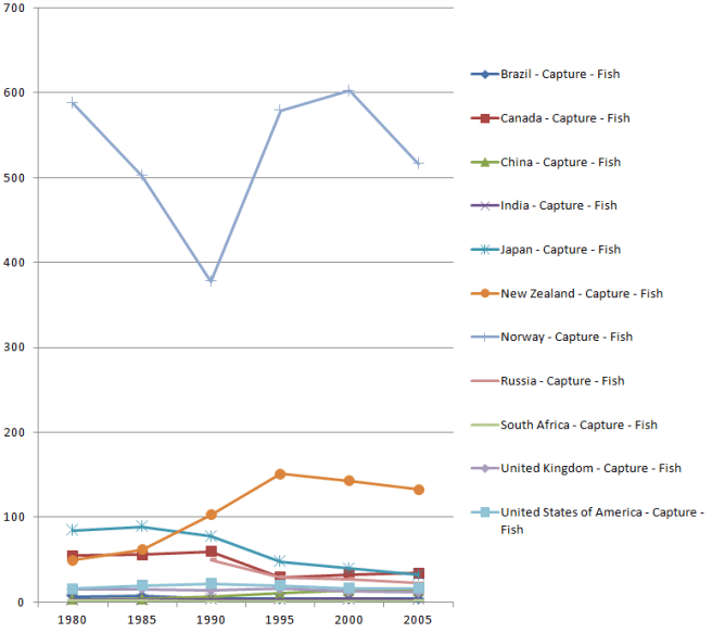
Using the same spreadsheet, I asked and answered some questions about fish production:
What’s the worldwide trend for capture versus aquaculture?
How much fish are certain countries capturing?
On a per capita basis?
How much fish are certain countries growing?
On a per capita basis?
The book raises very different kinds of questions. How should we treat the animals we eat? How much land should we use to raise crops that feed the animals we eat, instead of raising crops that feed people directly? We won’t find the answers to these kinds of questions in spreadsheets. But what I hope we will find — in spreadsheets, in linked databases, in data visualizations — is a framework that will ground our discussion of these and many other issues.
In order to get there, a number of puzzle pieces will have to fall into place. The exercise that yielded this particular spreadsheet led me to explore two that I want to discuss. One is PowerPivot. It’s a tool that comes from the world of business intelligence, but that I think will appeal much more widely as various sources of public data come online, and as various kinds of people realize that they want to analyze that data.
The other piece of this puzzle is Freebase Gridworks, which I’m testing in pre-release. The exercise I’ll describe here is really a collaboration involving Excel, PowerPivot, and Gridworks, in a style that I think will become very common.
My starting point, in this case, was data on fish and meat production from the Food and Agriculture Organization, via a set of OData feeds in Dallas. These series report total production by country, but since I also wanted to look at per-capita production I added population data from data.un.org to the mix.
To see how Gridworks and Excel/PowerPivot complement one another, let’s look at two PowerPivot tables. First, population:

Second, fish production:

PowerPivot is relational. Because these tables are joined by the concatenation of Country and Year, the PerCapita value in the production table is able to use that relationship. Here is the formula for the column:
=[value] / RELATED(‘population'[Pop in Millions])
In other words, divide what’s in the Value column of the production table by what’s in the Pop in Millions table for the corresponding Country and Year. This declarative style, available in PowerPivot, is vastly more convenient that Excel’s procedural style which requires table-flattening and lookup gymnastics.
But here’s the thing. In the world of business intelligence, the tables you feed to PowerPivot are likely to come from relational databases with strong referential integrity. In the realm of open-ended data mashups from a variety of sources, that’s not likely. For example, the Food and Agriculture series has rows for United States, but the population series has rows for United States of America. You have to reconcile those names before you can join the tables.
Enter Gridworks. To feed it the list of names to reconcile, I took this population table from Excel:
And stacked it on top of this food production table from Excel:
The only column that lines up is the Country column, but that’s all that mattered. I read the combined table into Gridworks, and told it to reconcile that column against the Freebase type country:
On the first pass, 8146 rows matched and 868 didn’t.
I focused on the rows that didn’t match.
And then I worked through the list. To approve all the rows with British Indian Ocean Territory, I clicked on the double checkmark shown here:
Sometimes the reconciled name differs:
Sometimes Gridworks doesn’t know what match to propose. One problem name that came up was Côte d’Ivoire, not Côte d’Ivoire, which is something that happens commonly when the proper character encoding is lost during data transfer. In that case, you can search Freebase for a match.
Proceeding in this manner I quickly reduced the set of unmatched names until I got to one that should not match.
Should it be Belgium? Luxembourg? Actually neither. At this point I realized that the population table was a mixture of country names and region names. I wanted to exclude the latter. So I matched up everything else, and was left with 202 rows that had names like Belgium/Luxembourg, Australia/New Zealand, Northern America, Western Africa, and World. When I selected just the matching rows for export, these unmatched rows were left on the cutting room floor.
I split the tables apart again, took them back into the Excel/PowerPivot environment, and found that things still didn’t quite work. In cases where the original and reconciled names differed, Gridworks was exporting the original name (e.g. Iran, Islamic Republic of) rather than the reconciled name (e.g., Iran). To export the reconciled names, I added a new column in Gridworks, based on the country column, and used a Gridworks expression to display the reconciled name.
There will be much more to say about PowerPivot and Gridworks. Each, on its own, is an amazing tool. But the combination makes my spidey sense tingle in a way I haven’t felt for a long time.


