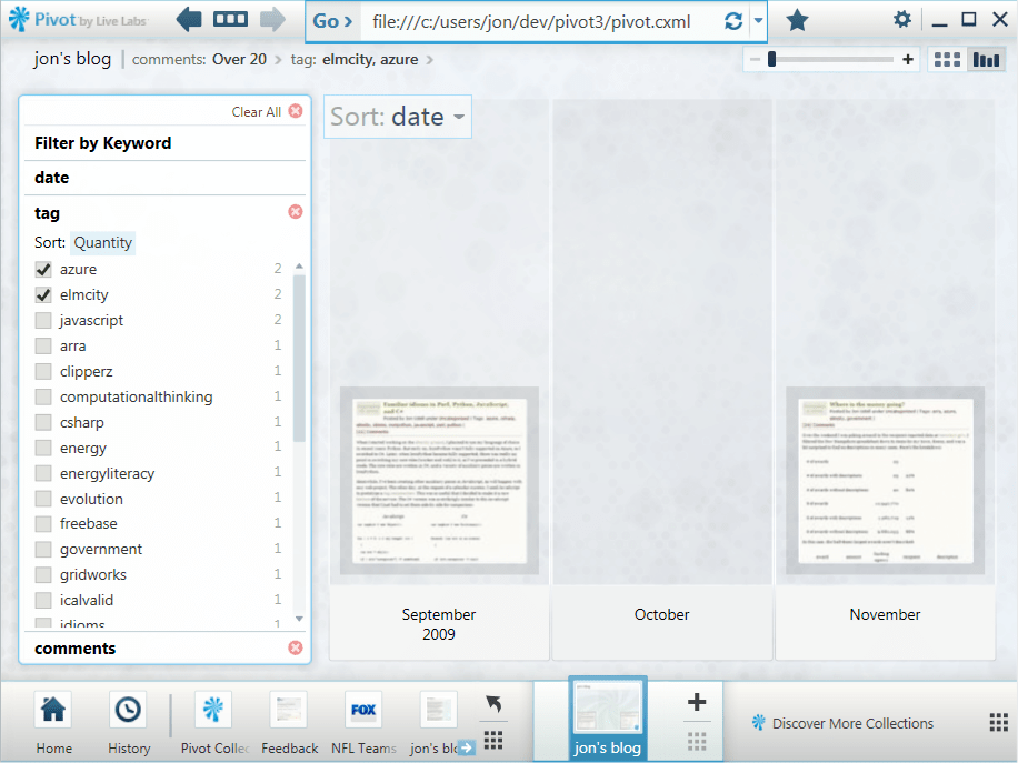
Talking with Scott Rosenberg about Say Everything, Dreaming in Code, and MediaBugs

My guest for this week’s Innovators show is Scott Rosenberg. He’s the author of two books, most recently Say Everything, subtitled How blogging began, what it’s becoming, and why it matters. Before that he was the Chandler project‘s embedded journalist, and told its story in Dreaming in Code. His current project is MediaBugs, a soon-to-be-launched service that aims to crowd-source the reporting and correction of errors in media coverage.

We began with a discussion of Say Everything. Its account of how blogging came to be is a great read, and a much-needed history of the era. Since I know that story quite well, though, we focused on the blogosphere’s present state and future prospects. Blogging is still a new medium. But those of us who experienced blogging as a conversation flowing through decentralized networks of blogs have now seen still newer (and more centralized) social media capture a lot of that conversation.

The good news is that more people are able to be involved. The fact that millions of people fired up blogs was, and remains, astonishing. But active blogging has proven to be a hard thing to sustain. Meanwhile hordes of people find it relatively easy to be active on Facebook and Twitter.

The bad news is that, as always, there’s no free lunch. While it’s easier to create and sustain network effects using Facebook and Twitter, you sacrifice control of your own data. Scott thinks we’re moving through a transitional phase, and I hope he’s right. We really need the best of two worlds. First, control of the avatars we project into the cloud, and of the data that surrounds them, insofar as that’s possible. Second, frictionless interaction. The tension between these two conflicting needs will define the future of social media.

Two of Scott’s other projects, Dreaming in Code and MediaBugs, are connected in an interesting way. The media project adopts terminology (“filing bugs”) and process (version control, issue tracking) from the realm of software. If MediaBugs helps make non-technical people aware of that crucial way of thinking and acting, it will be a bonus outcome.

A Pivot visualization of my WordPress blog

A Pivot experiment

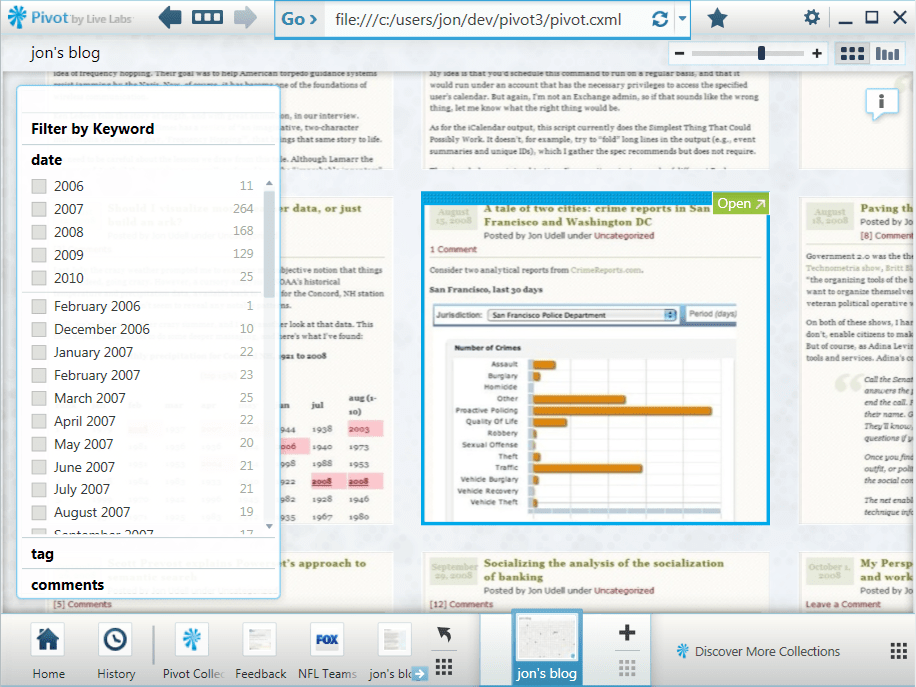
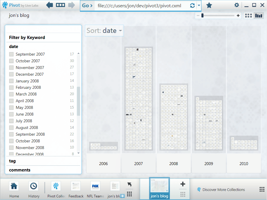
Pivot, from Microsoft Live Labs, is a data browser that visualizes data facets represented as Deep Zoom images and collections. I’ve been meaning to try my hand at creating a Pivot collection. My first experiment is a visualization of my blog which, in its current incarnation at WordPress.com, has about 600 entries. That’s a reasonable number of items for the simplest (and most common) kind of collection in which data and visuals are pre-computed and cached in the viewer. Here’s the default Pivot view of those entries.

The default view

To create this collection, I needed a visual representation of each blog entry. I didn’t think screenshots would be very useful, but the method worked out better than I expected. At the default zoom level there’s not much to see, but you can pick out entries that include pictures.

A selected entry

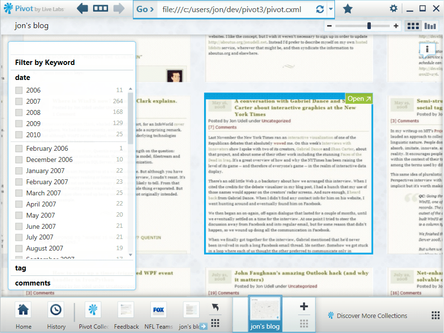
When you select an entry, the view zooms about halfway in to focus on it.

A text-only entry

Here’s a purely textual entry at the same resolution. If you click to enlarge that picture, you’ll see that at this level the titles of the current entry and its surrounding entries are legible.

The Show Info control

Clicking the Show Info control opens up an information window that displays title, description, and metadata. I’ve included the first paragraph of each entry as the description.
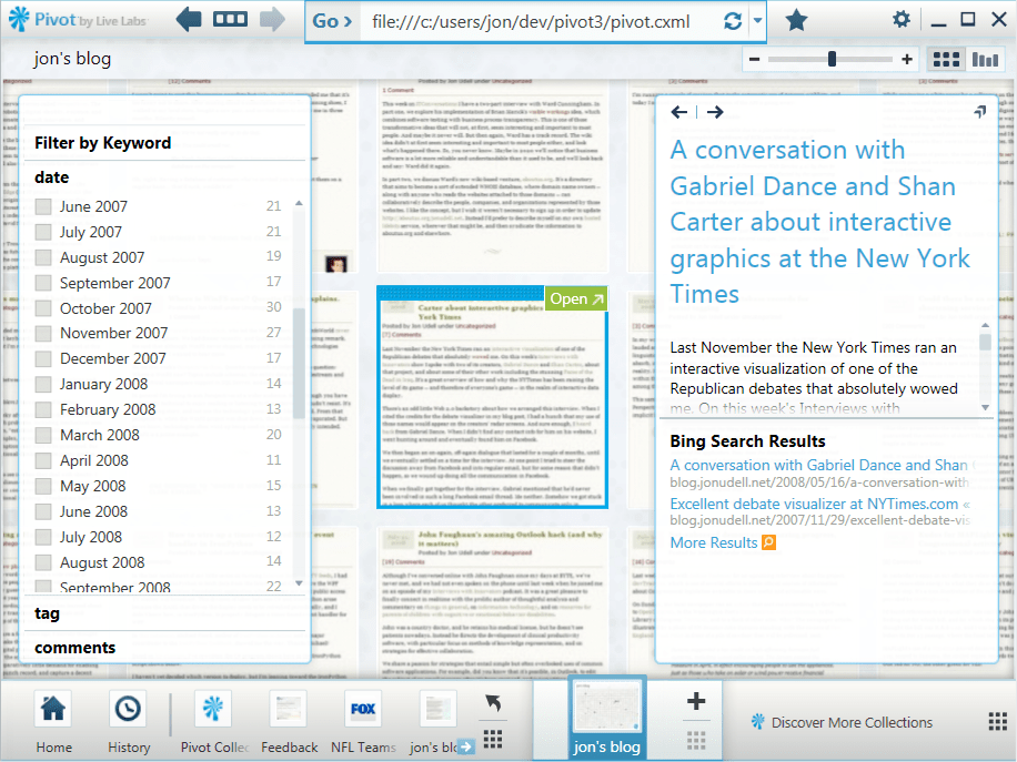
Zooming closer

If I zoom in further, the text becomes fully legible.

Histogram of entries

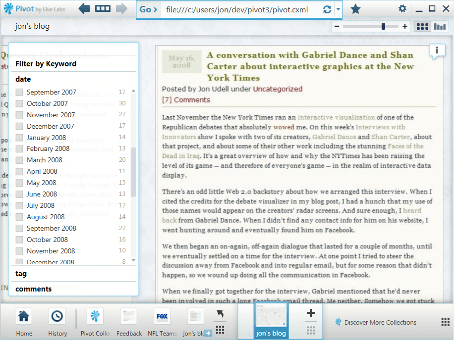
Of course the screenshot doesn’t capture the entire entry, it’s just a picture of the first screenful. To read the full entry, you click the Open control to view the entire HTML page inside Pivot.

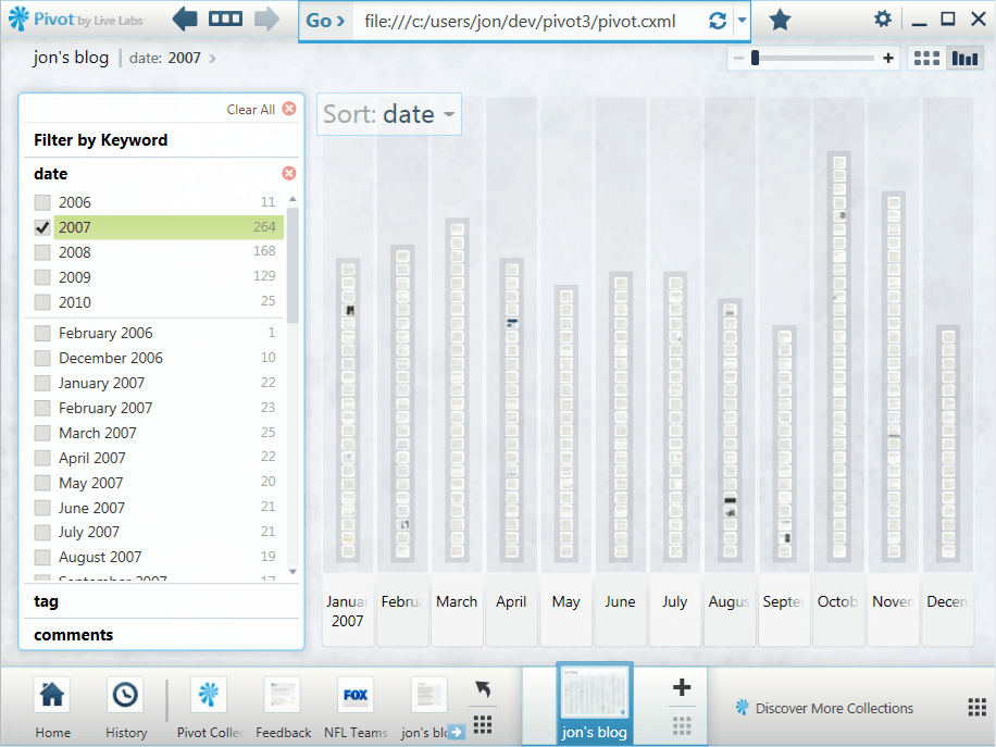
Pivot itself isn’t a reader, it’s a data browser. This becomes clear when you switch from item view to graph view. 2006 and 2010 are incomplete years, but the period 2007-2009 shows a clear decline. I suspect a lot of blogs would show a similar trend, reflecting Twitter’s eclipse of the blogosophere.

2007 distribution

Here’s the distribution for just the year 2007.

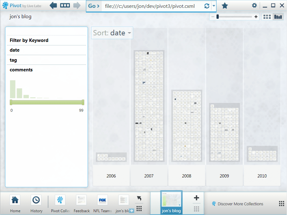
Histogram of comments

And here’s the comments facet, which counts the number of comments on each entry.

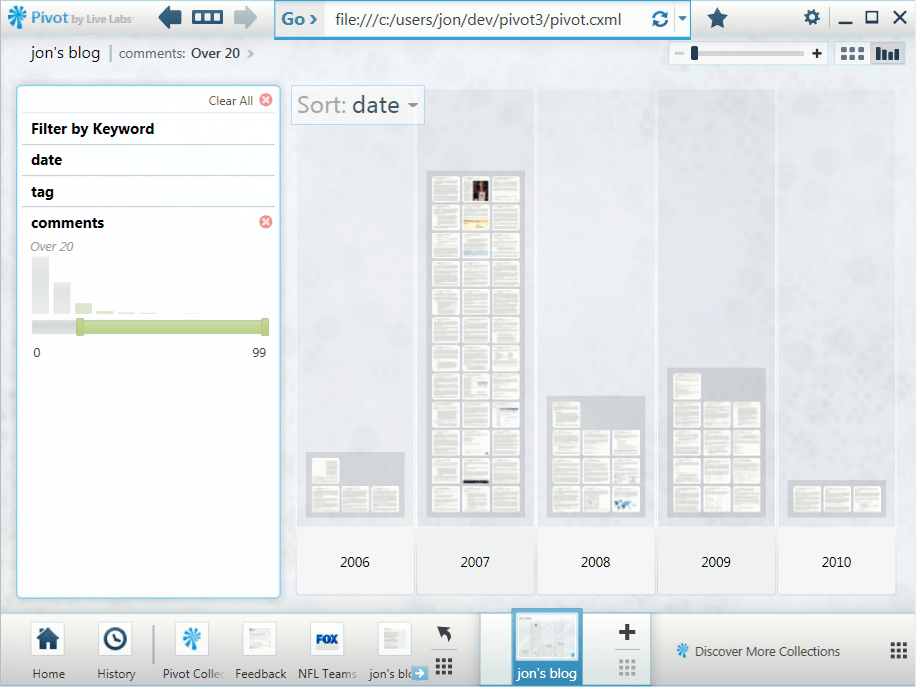
Histogram of entries with more than 20 comments

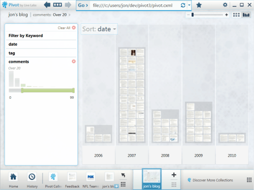
Adjusting the slider limits the view to entries with more than 20 comments.
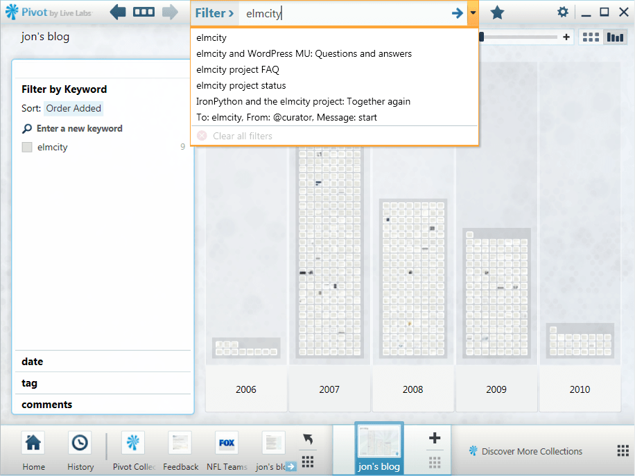
Filtering by tags

Of course I can also view entries by tags or tag combinations.

Filtering by keywords

When I start typing a keyword, the wordwheel displays matches from two namespaces: tags and titles.

Other possible views

Facets can be anything you can enumerate and count. I could, for example, count the number of images, tables, and other kinds of HTML constructs in each entry. That isn’t just a gratuitous exercise. Some years back, I outfitted my blog with an XQuery service that could search for items that contained more than a few images or tables, and it was useful for finding items that I remembered that way.

It would also be nice to include facets based on the WordPress stats API. And since a lot of the flow to the blog nowadays comes through bit.ly-shorted URLs on Twitter, a facet based on those referrals would be handy.

How I did it

Life’s too short to make 600 screenshots by hand, so the process had to be automated. Also, I want to be able to update this collection as I add entries to the blog. So I’m using IECapt to programmatically render pages as images, and the indispensable ImageMagick to crop the images in a standard way.

To automate the creation of Deep Zoom images (and XML files), I’m using deepzoom.py. (Note that I had to make two small changes to that version. At line 224, I changed tile_size=254 to tile_size=256. And at line 291 I changed PIL.Image.open(source_path) to PIL.Image.open(source_path.name).)

To build the main CXML (collection XML) file, I export my WordPress blog and run a Python script against it. I hadn’t looked at that export file in a long time, and was surprised to find that currently it isn’t quite valid XML. The declaration of the Atom namespace is missing. My script does a search-and-replace to fix that before it parses the XML.

I haven’t uploaded the collection to a server yet, because there are a bazillion little files and I’m still tweaking. Once I’m happy with the results, though, I should be able to establish a baseline collection on a server and then easily extend it an entry at a time.

If there’s interest I’ll publish the script. It’ll be more compelling, I suspect, once Pivot becomes available as a Silverlight control. Currently you have to download and install the Windows version of Pivot to use this visualization. But imagine if WordPress.com could deliver something like this for all of its blogs as a zero-install, cross-platform, cross-browser feature. That would be handy.

Freebase Gridworks: A power tool for data scrubbers

I’ve had many conversations with Stefano Mazzocchi and David Huynh [1, 2, 3] about the data magic they performed at MIT’s Project Simile and now perform at Metaweb. If you’re somebody who values clean data and has wrestled with the dirty stuff, these screencasts about a forthcoming product called Freebase Gridworks will make you weep with joy.

There’s one by David, and another by Stefano. Using common public datasets about food, international disasters, and US government contracts, they fly through a series of transformations that:

  • Merge similar names using a host of methods:
    • Automatic title-casing
    • A rich expression language
    • Analysis of “edit distance” between similar phrases, using several clustering algorithms
  • Split multi-valued facets
  • Create new facets (e.g., a year column from a data column)
  • Morph linear scales to log scales where appropriate

It’s all live, undoable, and fully instrumented, by which I mean that every transformation updates the counts of the values in each facet, and displays histograms of the new distribution of values — along with sliders for selecting and focusing on subsets.

As the open data juggernaut picks up steam, a lot of folks are going to discover what some of us have known all along. Much of the data that’s lying around is a mess. That’s partly because nobody has ever really looked at it. As a new wave of visualization tools arrives, there will be more eyeballs on more data, and that’s a great thing. But we’ll also need to be able to lay hands on the data and clean up the messes we can begin to see. As we do, we’ll want to be using tools that do the kinds of things shown in the Gridworks screencasts.

OData and PubSubHubbub: An answer and a question

I had been meaning to explore PubSubHubbub, a protocol that enables near-realtime consumption of data feeds. Then somebody asked me: “Can OData feeds update through PubSubHubbub?” OData, which recently made a splash at the MIX conference, is based on Atom feeds. And PubSubHubbub works with Atom feeds. So I figured it would be trivial for an OData producer to hook into a PubSubHubbub cloud.

I’ve now done the experiment, and the answer is: Yes, it is trivial. In an earlier post I described how I’m exporting health and performance data from my elmcity service as an OData feed. In theory, enabling that feed for PubSubHubbub should only require me to add a single XML element to that feed. If the hub that connects publishers and subscribers is Google’s own reference implementation of the protocol, at http://pubsubhubbub.appspot.com, then that element is:

<link rel="hub" href="http://pubsubbubbub.appspot.com"/>

So I added that to my OData feed. To verify that it worked, I tried using the publish and subscribe tools at pubsubhubbub.appspot.com, at first with no success. That was OK, because it forced me to implement my own publisher and my own subscriber, which helped me understand the protocol. Once I worked out the kinks, I was able to use my own subscriber to tell Google’s hub that I wanted my subscriber to receive near-realtime updates when the feed was updated. And I was able to use my own publisher to tell Google’s hub that the feed had been updated, thus triggering a push to the subscriber.

In this case, the feed is produced by the Azure Table service. It could also have been produced by the SQL Azure service, or by any other data service — based on SQL or not — that knows how to emit Atom feeds. And in this case, the feed URL (or, as the spec calls it, the topic URL) expresses query syntax that passes through to the underlying Azure Table service. Here’s one variant of that URL:

http://{ODATA HOST}/services/odata?table=monitor

That query asks for the whole table. But even though the service that populates that table only adds a new record every 10 minutes, the total number of records becomes unwieldy after a few days. So the query URL can also restrict the results to just recent records, like so:

http://{ODATA HOST}/services/odata?table=monitor&since_hours_ago=4

The result of that query, however, is different from the result of this one:

http://{ODATA HOST}/services/odata?table=monitor&since_hours_ago=24

Now here’s my question. The service knows, when it updates the table, that any URL referring to that table is now stale. How does it tell the hub that? The spec says that the topic URL “MUST NOT contain an anchor fragment” but “can otherwise be free-form.” If the feed producer is a data service that supports a query language, and the corresponding OData service supports RESTful query, there is a whole family of topic URLs that can be subscribed to. How do publishers and subscribers specify the parent?

YesAndNoSQL

I’ve written elsewhere about some of the reasons OData makes me happy. Following the announcements at MIX this week, best summarized here by Doug Purdy, I’d like to add another. It can be a nice bridge between the NoSQL and SQL worlds.

For example, my elmcity service monitors itself by sampling a bunch of performance counters and pushing the data to an Azure table. Because the Azure Table service is an OData producer, I’m able to analyze and chart the data using PowerPivot, an Excel add-in that’s an OData consumer.

I’ve been thinking about moving this data store over to SQL Azure, because some kinds of queries I might want to run will be much easier using SQL rather than Azure Table’s primitive query language. Now that SQL Azure is also an OData producer I’ll be able to make that switch seamlessly. From a SQL perspective I’ll have a more powerful query capability. But from a NoSQL perspective it’ll look just the same.

I’ve always loved Sam Ruby’s tagline: It’s just data. I should be able to spin up a service using a decentralized key/value store, like Azure Table or SimpleDB, and then gracefully migrate to a SQL store if and when that becomes necessary. With OData living on both sides of the SQL/NoSQL divide, that glide path will be much smoother.

Joining web namespaces

The other day I read the following statement in the Economist:

Sensitivity of the data will decide if an application is suitable for processing in the cloud.

The writer does not mention, and probably is unaware of, the principle of translucent data. In a translucent database, the data is encrypted and thus opaque to the operator of the database. Users of the data share keys to unlock the data, and can do anything with cleartext copies that they keep locally. Can real and useful applications be built in this kind of regime? We don’t really know, because hardly anybody has tried. But if it turns out to be possible, it could become a foundation of cloud computing.

I wanted to advance the story. In particular, I wanted to help make a connection between that statement in the Economist and the idea of data translucency. I’ve written about translucency on my blog, and those entries are tagged on delicious. But nowadays the attention stream flows mainly through Twitter. So I composed this tweet:

Economist: “Sensitivity of the data will decide if an application is suitable for processing in the cloud.” Unless the data is #translucent.

There’s a limit to what you can do in 140 characters. That tweet uses all 140, but still falls short of what I wanted to do:

  • Quote from the Economist
  • Link to the Economist
  • Colonize a formerly empty hashtag namespace (#translucency)
  • Connect that namespace to its delicious counterpart

Inevitably I failed to do all that in 140 characters. Reflecting on the failure, I made this LazyWeb wish:

I wish I could tweet the command “join http://delicious.com/judell/translucency to #translucent and #translucency”

I’ve had some success joining tag namespaces from different domains. I mentioned the idea in this entry, and a commenter (engtech) provided a nifty solution based on Yahoo Pipes. I have since used it to keep track of items tagged icalvalid on blogs, on delicious, and on Twitter.1

My LazyWeb wish came from that experience, plus another which I wrote up in an entry entitled To: elmcity, From: @curator, Message: start. That entry describes how elmcity curators can now use Twitter direct messages to send commands to the elmcity service. The mechanism harkens back to Rael Dornfest’s brilliant Sandy, a service that acted as a personal assistant and responded to a repertoire of command messages.

Sandy lost her job when Rael went to work for Twitter. I’ve wondered if she would be rehired there. If so, a command like the one I proposed might be an example of the kind of thing she could do.

On further reflection, I’m not really sure what such a command would mean, or whether it would make sense to use Twitter to send it, or indeed whether it would make sense for Twitter (rather than some other service) to respond to it. But I’m in an exploratory mood, so let’s explore.

It would be straightforward to create a service that would take the Yahoo Pipes trick to the next level. Instead of editing and saving a Yahoo Pipe, you’d just command that service to merge the set of feeds for some tag. That command might best take the form of a URL:

http://tagjoiner.org/join/TAG?delicious=yes&twitter=yes&wordpress=yes

As is true for my combined icalvalid feed, the result formats could be HTML for viewing and RSS for feed splicing. As the creator of the joined feed, I’m aware that it exists, and I can cite it when I want to direct people’s attention to the union of the namespaces.

But suppose I wanted the joined namespace to be more discoverable than that? Here’s where it might make sense for Twitter to be involved. If a hashtag search on Twitter did the join, it could be made evident to the followers of the person making the join request, or even to anyone searching for the hashtag involved in the request.

This is almost surely too indirect and too abstract to ever make sense as a mainstream feature. But it’s fun to imagine. If I’ve made an investment in a tag on delicious, or WordPress, or somewhere else, I’d like to be able to bring those items to the attention of people who encounter the corresponding Twitter hashtag.

The general idea behind all this goes way beyond Twitter, of course. Waiting in the wings is a whole class of services that reconcile different web namespaces.


1 That feed used to include a mix of items marked [DELICIOUS] and [TWITTER]. But the Twitter items are less durable and seem to have aged out of the combined feed.

A geek anti-manifesto

The other day my colleague Scott Hanselman wrote a useful essay called 10 Guerilla Airline Travel Tips for the Geek-Minded Person. It’s a mixture of technical and social strategies. The tech strategies include marshaling data with the help of services like Tripit, FlightStats, and SMS alerts. The social strategies include being nice to service reps, and using the information you’ve marshaled in order to make precise requests that they’re most likely to be able to satisfy.

Scott writes:

I’m a geek, I like tools and I solve problems in my own niche way.

That statement, along with the essay’s tagline — …Tips for the Geek-Minded Person — has been bothering me ever since I read it. Why is it geeky to marshal the best available data? Why is it geeky to use that data to improve your interaction with people and processes?

My Wikipedia page includes this sentence:

Udell has said, “I’m often described as a leading-edge alpha geek, and that’s fair”. 1

I did say that, it’s true. But I’ve come to regret that I did. For a while I thought that was because geek was once defined primarily as a carnival freak. That’s changed, of course. Nowadays the primary senses of the word are obsessive technical enthusiasm and social awkwardness. Which is better than being somebody who bites the heads off chickens. But it’s still not how I want to identify myself. Much more importantly, it’s not how I want the world to identify the highest and best principles of geek identity and culture.

Fluency with digital tools and techniques shouldn’t be a badge of membership in a separate tribe. In conversations with Jeannette Wing and Joan Peckham I’ve explored the idea that what they and others call computational thinking is a form of literacy that needs to become a fourth ‘R’ along with Reading, Writing, and Arithmetic.

The term computational thinking is itself, of course, a problem. In comments here, several folks suggested systems thinking which seems better.

Here’s a nice example of that kind of thinking, from Scott’s essay:

#3 Make their job easy

Speak their language and tell them what they can do to get you out of their hair. Refer to flights by number when calling reservations, it saves huge amounts of time. For example, today I called United and I said:

“Hi, I’m on delayed United 686 to LGA from Chicago. Can you get me on standby on United 680?”

Simple and sweet. I noted that UA680 was the FIRST of the 6 flights delayed and the next one to leave. I made a simple, clear request that was easy to grant. I told them where I was, what happened, and what I needed all in one breath. You want to ask questions where the easiest answer is “Sure!”

I see two related kinds of systems thinking at work here. One engages with an information system in order to marshal data. Another engages with a business process — and with the people who implement that process — in a way that leverages the data, reduces process friction, and also reduces interpersonal friction.

These are basic life skills that everyone should want to master. If we taught them broadly, and if everyone learned them, then this sort of mastery wouldn’t attract the geek label. But we don’t teach these skills broadly, most people don’t learn them, and the language we use isn’t our friend. If systems thinking is geeky then only geeks will be systems thinkers. We can’t afford for that to be true. We need everyone to be a systems thinker.


1 Actually I’d say that Scott Hanselman is a leading-edge alpha geek. I am, at best, a trailing-edge beta or gamma geek. But if someone were to remove the word entirely from my Wikipedia page, I’d be fine with that. I no longer want to be labeled as any kind of geek.

Atul Gawande on why heroes use checklists

The sound track for yesterday’s run was a compelling talk by Atul Gawande about his new book The Checklist Manifesto, which grew from an article in the New Yorker. Although his story is grounded in the practice of health care, the lessons apply much more broadly to every field in which we grapple with complexity.

For most of human history, he argues, we were limited by lack of knowledge. We just didn’t know how to do things right. Now that knowledge is abundant the enemy is no longer ignorance but rather ineptitude — the failure to marshal and apply what we know.

The surprising thing Atul Gawande learned, and now passionately conveys, is that simple checklists turn out to be extraordinarily powerful tools for marshalling knowledge and for ensuring its correct use.

The biggest roadblock is pushback from highly-trained experts who are offended by the idea. After 8 years of medical school, and in a regime that already demands vast amounts of paperwork, why should a doctor have to check off basic items on a list? Because we are fallible in the face of complexity, Gawande says, and because checklists work. Although he led research in this area he was skeptical about adopting checklists in his own operating rooms. But when he did, he made two critical discoveries. First, well-made checklists are easy to use. Second, they almost always caught errors.

Most of those errors turned out to be non-critical. Only a few of the catches saved lives. That alone, of course, is enough reason to adopt checklist discipline. But it was shocking for the medical teams to discover that simple and basic procedures, which they thought were being carried out with 100% fidelity, in fact weren’t.

We are willing to tolerate failure when it results from unavoidable ignorance, Gawande says. If we really don’t know how to cure a disease, then OK. You tried your best, you failed, that’s how it is. But if we do know, and screw up, that’s unforgivable. What do you mean she died because somebody forgot to administer the antibiotic, or to wash his hands? Unacceptable.

The struggle with complexity I know best happens in the realm of software. What do our checklists look like? One obvious form is the test suite. If my software keeps passing its tests as I evolve it, there’s still plenty that can and will go wrong, but at least I know it still does what the tests say it does. Once, recently, I deployed a version of the service I’m building that failed in a way my tests would have caught. How did that happen? I was so sure I hadn’t changed anything that the tests would catch that I didn’t bother to rerun them. That’s an unforgivable lapse of discipline I don’t plan to repeat.

But software tests aren’t really the sort of checklist that Gawande writes and speaks about. Here’s something closer to what he means: Best practices in web development with Python and Django. That list comes from Christopher Groskopf, a web developer at the Chicago Tribune, who writes:

In our fast-paced environment there is little justification for being confused when it could have been avoided by simply writing it down.

We need to recognize and honor this kind of work. It is unsexy but heroic, and I use that word deliberately. The power of the checklist discipline, Gawande says, should prompt us to rethink our definition of heroism. Consider Capt. Chesley “Sully” Sullenberger:

It was fascinating to watch people responding to the miracle on the Hudson. All of us, staring in amazement, thinking what a hero he was. But none of us willing to listen to what he really was saying. He kept saying it wasn’t flight ability, but instead adherence to discipline, and teamwork. But it was as if we couldn’t process what he was trying to tell us.

Because there were checklists, and because everybody used them, Sully could rise above the dumb stuff and focus on the one key decision for which human judgement was required. The heroic part of that flight was not the flight ability of Capt. Sullenberger, it was the willingness of the entire team — including the flight attendants, who then acted through their protocols to get the passengers off that plane in three minutes — to acknowledge their fallibility, admit that they could fail by relying only on training and memory, and exercise the discipline to overcome that fallibility.

The talk raises important questions for practitioners in every field. What makes checklists easy to use? What makes them effective? In the realm of software, we have plenty of examples to look at: django, WordPress, C#, ASP.NET, etc. It might be fruitful to explore these, merge similar lists, and codify stylistic patterns that can govern all such lists.

Hey Honda, I paid for that data!

Yesterday at the Honda dealer’s service desk I found myself in an all-too-familiar situation, craning my head for a glimpse of a screenful of data that I paid for but do not own. Well, that’s not quite true. I do have a degraded form of the data: printouts of work orders. But I don’t have it in a useful form that would enable me to compute the ownership cost of my car, or share its maintenance history with owners of similar cars so we can know which repairs have been normal or abnormal.

Although we tend to focus on the portability of our health care data, the same principles apply to all kinds of service providers. And in many of those cases, we would be less concerned about the privacy of the data.

Why, then, don’t service providers and their customers co-own this data? Is it because providers want to keep high-quality electronic data, while only dispensing low-quality paper data, in order to make their services stickier? It would make a certain kind of sense for Honda to think that way, but I don’t think that’s the answer. Instead:

1. Nobody asks for the data.

2. There’s no convenient way to provide it.

We’ll get over the first hurdle as our cultural expectations evolve. Today it would be weird to find an OData URL printed on your paid work order. In a few years, I hope, that will be normal.

We’ll get over the second hurdle as service providers begin to colonize the cloud. One of the key points I tried to make in a recent interview about cloud computing is that cloud-based services can flip a crucial default setting. If you want to export access to data stored in today’s point-of-sale and back-end systems, you have to swim upstream. But when those systems are cloud-based, you can go with the flow. The data in those systems can still be held closely. But when you’re asked to share it, the request is much easier to satisfy.

Talking with Duncan Wilson about architecture in the age of networked services

My guest for this week’s Innovators show is Duncan Wilson, an engineer with the global consulting firm Arup. We met at the 2010 Microsoft Research Social Computing Symposium, where the theme was city as platform. His presentation, and our follow-on conversation, prompted me to read a couple of books that had long been in my queue: Stewart Brand’s How Buildings Learn and Christopher Alexander’s A Pattern Language.

Reading both of those books, I felt an implicit connection between principles that I’ve learned in an IT context (e.g., separation of concerns, networks of loosely-coupled services), and principles that can inform the practice of architecture — at the scale of buildings, but also of whole cities. Duncan Wilson, and others lucky enough to be working at the forefront of 21st-century architecture, are making that connection explicit.

Consider, for example, the movement of goods in and out of a city. You’d like to consolidate that activity at the perimeter and reduce truck traffic in the core. That’s doable, but only if retailers and suppliers are willing to share information about what they’re shipping. That began to happen in the late 1990s, Duncan says, when retailers and suppliers began to share trucks. Doing the same kind of thing for a city, as Arup’s engineers envision, would entail both a physical arrangement of consolidation centers on the perimeter, and a virtual arrangement of shared data.

Information, Duncan says, is becoming another of the raw materials from which the built environment is made.

Here’s a different example of IT principles crossing over into other realms, from a podcast I listened to on yesterday’s hike:

When you offer multiple services using the same devices, through the same interfaces, you open up opportunities for creative thinking in the storage community.

If you’re talking about data storage, and the frame of reference is IT, that’s not a very compelling statement. We haven’t fully internalized this service-oriented and network-based way of thinking, but we’re getting there.

But that quote doesn’t refer to data storage, it refers to energy storage. The podcast was Stephen Lacey’s excellent Inside Renewable Energy. In this episode, innovators at Ice Energy and A123 describe business models that are deeply informed by the idea of networks of shared services.